The Importance of Typography Within Your Print Design
The art of typography involves selecting and arranging fonts strategically to enhance the readability and visual appeal of the written language within your project. Here are 5 reasons why typography is important in print designs:
1. Communication and Readability
Typography ensures that your content is not only easy to read but also understandable. Font choices, sizes, line spacing and paragraph formatting all significantly impact how well your message is conveyed.
2. Branding and Identity
It helps to establish and reinforce your brand's identity. Consistently using specific fonts across all brand materials, from logos to brochures, encourages recognition and strengthens brand cohesion.
3. Emotional Impact
Various fonts have the power to evoke different emotions. For example, a playful script font might be ideal for a children's event poster, while a sleek and modern sans-serif font could be a suitable choice for a tech company's brochure. Typography allows you to set the tone and evoke specific emotional responses from your audience.
4. Visual Hierarchy
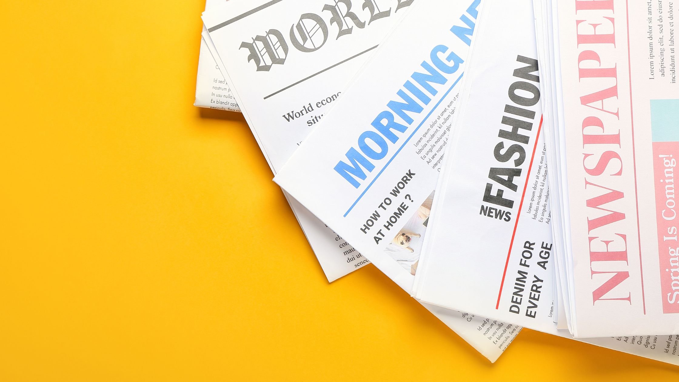
Typography is a valuable tool for establishing a visual hierarchy within a printed design. By utilising diverse fonts and styles, you can emphasize headlines, subheadings and body text, guiding your reader's eye through the content effectively.
5. Aesthetics and Balance
It contributes significantly to the overall visual appeal of a design. Thoughtfully chosen fonts that complement the content and layout create a visually pleasing and balanced printed design.
When selecting fonts for your print design you must have a good understanding on your audience and the primary goal of your project. This will ensure you promote the intended message and attract the right target audience. Try creating variety and excitement to your project use 2-3 different font styles and sizes that complement each other, and maintain consistency by selecting a font that includes multiple styles (regular, bold, italic).
By following these typography tips, you will create a visual connection that helps your audience recognise and remember your brand's identity. And when in doubt, get in touch with us and we will ensure your print designs reach the right audience!

